Migrating to v6
This guide explains how and why to migrate from Material UI v5 to v6.
Start using the beta release
In your package.json file, change the package version from latest to next.
-"@mui/material": "latest",
+"@mui/material": "next",
Optionally, if you are using one of these packages, you can also change their version to next:
@mui/icons-material@mui/system@mui/lab@mui/material-nextjs@mui/styled-engine-sc@mui/utils
Using next ensures your project always uses the latest v6 beta release.
Alternatively, you can also target and fix it to a specific version, for example, 6.0.0-beta.0.
Why you should migrate
Material UI v6's biggest highlight is the introduction of Pigment CSS, a next-gen zero-runtime CSS-in-JS library, as an opt-in styling engine. Using it will make your project compatible with React Server Components, as well as help reduce its bundle size due to styles being extracted at build time, avoiding client-side recalculation.
As a lesson learned from v5, this major release introduces minimal breaking changes. Namely, browser support updates, a Node.js version bump, and the removal of the UMD bundle. These updates reduced the Material UI package size by 2.5MB, 25% of the total size, and can be, for the most part, migrated automatically via codemods.
Aside from that, v6 also includes a few quality-of-life improvements regarding styling:
- The
CssVarsProviderAPI is now stable. That enables you to rely on CSS variables, allowing for more intricate and performant customization possibilities, along with improved overall developer experience. - Support for container queries within the theme.
- A new theme utility for adding styles to specific color modes.
Supported browsers and Node versions
The targets of the default bundle have changed in v6.
The exact versions will be pinned on release from the browserslist query: "> 0.5%, last 2 versions, Firefox ESR, not dead, safari >= 15.4, iOS >= 15.4".
- Node.js 14 (up from 12)
- Chrome 109 (up from 90)
- Edge 121 (up from 91)
- Firefox 115 (up from 78)
- Safari 15.4 in both macOS and iOS (up from 14 in macOS and 12.5 in iOS)
- and more (see .browserslistrc
stableentry)
Removed support for IE 11
Support for IE 11-that is, the legacy bundle and all IE 11-related code-is completely removed. This decreases Material UI's bundle size and eases future development.
If you need to support IE 11, you can use v5's legacy bundle. However, note that it won't get updates or bug fixes.
Update React & TypeScript version
Update React
The minimum supported version of React is v17.0.0 (the same as v5).
Use the snippet below to update your project (replace the <version> with the one you want):
npm install react@<version> react-dom@<version>Update TypeScript
The minimum supported version of TypeScript has been increased from v3.5 to 4.7.
If your project includes these packages, you'll need to update them:
@types/react@types/react-dom
Breaking changes
UMD bundle was removed
To align with React 19's removal of UMD builds, Material UI has also removed its UMD bundle.
This results in a reduction of the @mui/material package size by 2.5MB or 25% of the total package size.
See Package Phobia for more details.
Instead, using ESM-based CDNs such as esm.sh is recommended. For alternative installation methods, refer to the CDN documentation.
Autocomplete
New reason values added to onInputChange
Three new possible values have been added to the reason argument in the onInputChange callback of the Autocomplete component.
These three were previously treated as "reset", so if you are relying on that, you might need to adjust your code accordingly:
"blur": like"reset"but triggered when the focus is moved off the input.clearOnBlurmust betrue."selectOption": triggered when the input value changes after an option has been selected."removeOption": triggered in multiple selection when a chip gets removed due to the corresponding option being selected.
These are added on top of the existing ones: "input", "reset", and "clear".
Accordion
Heading element wrapping Accordion Summary
To meet the W3C Accordion Pattern standard, the Accordion Summary is now wrapped with a default h3 heading element. This change may affect customizations relying on the previous DOM structure and CSS specificity. Additionally, the default heading element might conflict with existing heading structures on your page.
If your styles or DOM manipulations depend on the old structure, you will need to update them to accommodate the new heading element. If the default heading element conflicts with your existing structure, you can change the heading element using the slotProps.heading.component prop.
<Accordion slotProps={{ heading: { component: 'h4' } }}>
  <AccordionSummary
    expandIcon={<ExpandMoreIcon />}
    aria-controls="panel1-content"
    id="panel1-header"
  >
    Accordion
  </AccordionSummary>
  <AccordionDetails>
    Lorem ipsum dolor sit amet, consectetur adipiscing elit. Suspendisse malesuada
    lacus ex, sit amet blandit leo lobortis eget.
  </AccordionDetails>
</Accordion>
Chip
Previously, the Chip component lost focus when the escape button was pressed, which differed from how other button-like components work. This issue has been resolved, and the Chip now retains focus as expected.
If you want to keep the previous behavior, add a custom onKeyUp handler, as shown below:
import * as React from 'react';
import Chip from '@mui/material/Chip';

export default function ChipExample() {
  const chipRef = React.useRef(null);
  const keyUpHandler = (event) => {
    if (event.key === 'Escape' && chipRef.current) {
      chipRef.current.blur();
    }
  };
  return (
    <Chip
      label="Chip Outlined"
      variant="outlined"
      ref={chipRef}
      onKeyUp={keyUpHandler}
    />
  );
}
Divider
When using vertical orientation, the Divider now renders a <div> with the corresponding accessibility attributes instead of <hr> to adhere to the WAI-ARIA spec. You might need to adjust your styles accordingly if you are targeting hr tags in your CSS.
-import Divider from '@mui/material/Divider';
+import Divider, { dividerClasses } from '@mui/material/Divider';

 const Main = styled.main({
-  '& hr': {
+  [`& .${dividerClasses.root}`]: {
     marginTop: '16px',
   },
 });
Loading Button
The children passed to the Loading Button component is now wrapped in a <span> tag to avoid issues when using tools to translate websites.
Grid v2 (Unstable_Grid)
The Grid2 was updated and stabilized:
- The previous size (
xs,sm,md, ...) and offset (xsOffset,smOffset,mdOffset, ...) props, which were named after the theme's breakpoints, were replaced with thesizeandoffsetprops. - The spacing mechanism was reworked to use the
gapCSS property.
This brings some breaking changes described in the following sections.
ListItem
ListItem's props autoFocus, button, disabled, and selected, deprecated in v5, have been removed. To replace the button prop, use ListItemButton instead. The other removed props are available in the ListItemButton component as well.
-<ListItem button />
+<ListItemButton />
Use this codemod to migrate your project to the ListItemButton component:
npx @mui/codemod@next v6.0.0/list-item-button-prop <path/to/folder>
As the ListItem no longer supports these props, the class names related to these props were removed. You should use the listItemButtonClasses object instead.
-import { listItemClasses } from '@mui/material/ListItem';
+import { listItemButtonClasses } from '@mui/material/ListItemButton';

- listItemClasses.button
+ listItemButtonClasses.root

- listItemClasses.focusVisible
+ listItemButtonClasses.focusVisible

- listItemClasses.disabled
+ listItemButtonClasses.disabled

- listItemClasses.selected
+ listItemButtonClasses.selected
Stabilized API
The Grid2 component API was stabilized, so its import no longer contains the Unstable_ prefix:
-import { Unstable_Grid2 as Grid2 } from '@mui/material';
+import { Grid2 } from '@mui/material';
-import Grid from '@mui/material/Unstable_Grid2';
+import Grid from '@mui/material/Grid2';
Size and offset props
Previously, the size and offset props were named corresponding to the theme's breakpoints. For the default theme this was:
- Size:
xs,sm,md,lg,xl - Offset:
xsOffset,smOffset,mdOffset,lgOffset,xlOffset
In v6, these props are renamed to size and offset:
 <Grid
-  xs={12}
-  sm={6}
-  xsOffset={2}
-  smOffset={3}
+  size={{ xs: 12, sm: 6 }}
+  offset={{ xs: 2, sm: 3 }}
 >
Note that if the size or offset is the same for all breakpoints, you can use a single value:
-<Grid xs={6} xsOffset={2}>
+<Grid size={6} offset={2}>
Besides that, the true value for the size prop was renamed to "grow":
-<Grid xs>
+<Grid size="grow">
Use this codemod to migrate your project to the new size and offset props:
npx @mui/codemod@next v6.0.0/grid-v2-props <path/to/folder>
If you have custom breakpoints, the change is the same:
-<Grid mobile={12} mobileOffset={2} desktop={6} desktopOffset={4}>
+<Grid size={{ mobile: 12, desktop: 6 }} offset={{ mobile: 2, desktop: 4 }}>
Which you can cover with the same codemod by providing the custom breakpoints as an argument:
npx @mui/codemod@next v6.0.0/grid-v2-props <path/to/folder> --jscodeshift='--muiBreakpoints=mobile,desktop'
Removal of the disableEqualOverflow prop
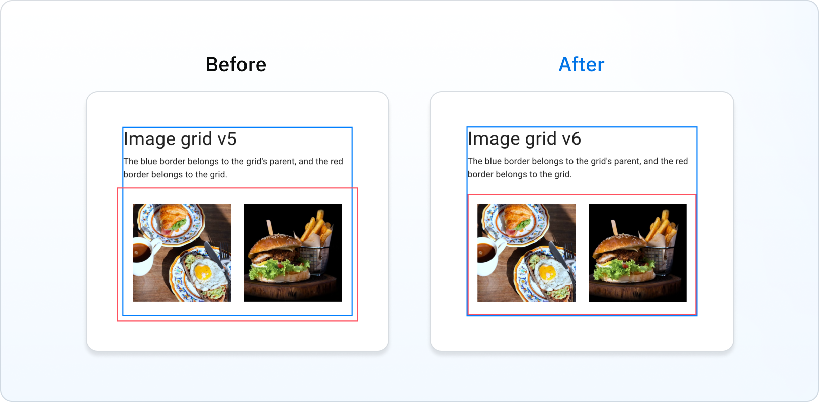
Previously, the Grid overflowed its parent. In v6, this is fixed, with the Grid being contained inside its parent's padding:

This removes the need for the disableEqualOverflow prop:
-<Grid disableEqualOverflow>
+<Grid>
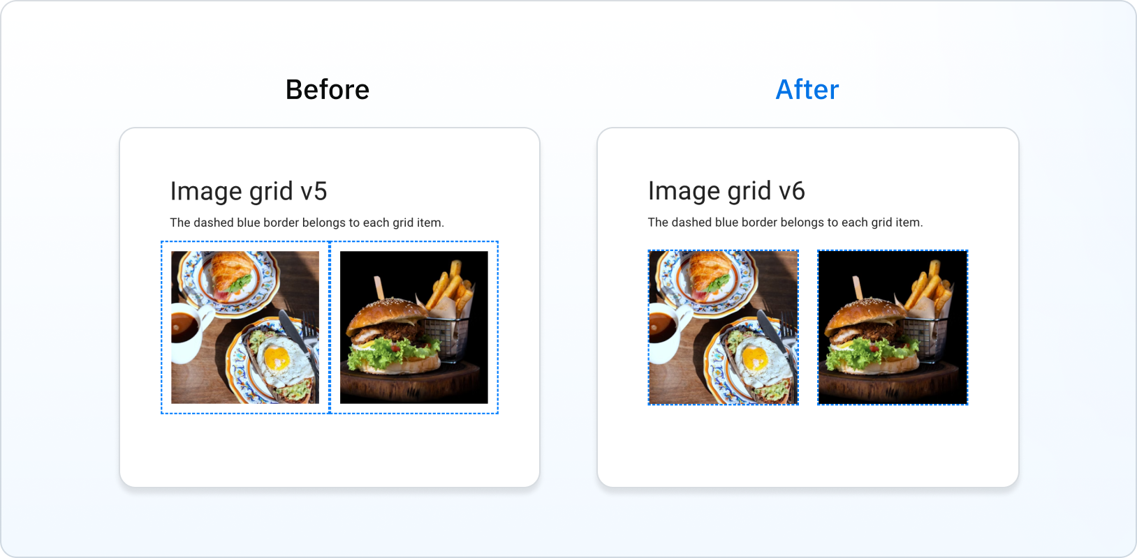
Spacing is no longer considered inside the Grid item's box
Previously, Grid items included spacing in their boxes. In v6, this is fixed:

Rating
Previously, due to a bug, the aria-label attribute was "null Stars" when no value was set in the Rating component.
This is fixed in v6, with the aria-label attribute being "0 Stars" when no value is set.
useMediaQuery
The following deprecated types were removed:
MuiMediaQueryList: useMediaQueryList(from lib.dom.d.ts) instead.MuiMediaQueryListEvent: useMediaQueryListEvent(from lib.dom.d.ts) instead.MuiMediaQueryListListener: use(event: MediaQueryListEvent) => voidinstead.
Stabilized APIs
CssVarsProvider and extendTheme
The CssVarsProvider and extendTheme APIs are now stable.
If you already use them in v5, you can now drop the experimental prefix.
-import { experimental_extendTheme as extendTheme, Experimental_CssVarsProvider as CssVarsProvider } from '@mui/material/styles';
+import { extendTheme, CssVarsProvider } from '@mui/material/styles';
Check out the CSS theme variables page to learn more about it.
Add styles for specific color modes
Material UI v6 introduces a new utility for adding styles to specific color modes called theme.applyStyles.
It's designed to replace theme.palette.mode when applying light or dark styles.
 const MyComponent = styled('button')(({ theme }) => ({
   padding: '0.5rem 1rem',
   border: '1px solid,
-  borderColor: theme.palette.mode === 'dark' ? '#fff' : '#000',
+  borderColor: '#000',
+  ...theme.applyStyles('dark', {
+    borderColor: '#fff',
+  })
 }))
Use these codemods to migrate your project to theme.applyStyles:
npx @mui/codemod@next v6.0.0/styled <path/to/folder-or-file>
npx @mui/codemod@next v6.0.0/sx-prop <path/to/folder-or-file>
npx @mui/codemod@next v6.0.0/theme-v6 <path/to/theme-file>
Deprecations
Components props
The components and componentsProps props have been deprecated in favor of slots and slotProps, making the API surface of the components more consistent.
Check out the deprecations page to learn which component no longer has these props.
System props
System props, such as mt={*}, bgcolor={*}, and others, are deprecated in the Box, Typography, Link, Grid, and Stack components.
Move all system props into the sx prop by using the codemod below:
npx @mui/codemod@next v6.0.0/system-props <path/to/folder>
Or do it manually like the example below:
-<Button mr={2}>
+<Button sx={{ mr: 2 }}>
Theme component variants
Custom component variants defined in the theme are now merged with the theme style overrides, defined within the root slot of the component.
Update the theme file using the codemod:
npx @mui/codemod@next v6.0.0/theme-v6 <path/to/theme>
Or do it manually like the example below:
 createTheme({
   components: {
     MuiButton: {
-      variants: [ ... ],
+      styleOverrides: {
+        root: {
+          variants: [ ... ]
+        }
+      }
     }
   }
 })
This reduces the API surface and lets you define variants in other slots of the component.
Pigment CSS integration (optional)
Check out the Pigment CSS migration page to learn how to integrate it into your project.